

You choose a beautiful color, fill a shape, and then notice tiny white flecks showing through it. Why does the same oil pastel sometimes look richly colored and sometimes look patchy?
The short answer: A light stroke often touches the raised parts of the paper while leaving its tiny hollows visible. A firmer stroke deposits more color, and turning the stick changes how much of its surface meets the page. The paper, the particular color, and the softness of the stick also matter. Before you press as hard as you can, change one thing at a time and look at the mark it makes.
First, decide whether the paper grain is a problem
Those white flecks can be part of the drawing. They give a pale sky air, make a sandy path sparkle, or let an early sketch stay light enough to develop. In other places, such as a bold flower petal or a flat graphic shape, you may want a fuller field of color.
Paper is not perfectly flat. Its texture, often called its tooth, catches drawing material unevenly. On textured paper, a gentle pass may color the high points first. A smoother sheet can show fewer gaps, but changing paper also changes how the pastel feels and how much material the surface can hold. For this exercise, keep the paper fixed so you can see what your hand and the stick angle do.
Oil pastels can create both broad areas of color and narrower lines. Using different parts of the stick makes those marks easier to control.
Try one color three ways
Make three small boxes on the same sheet of paper. Use the same oil pastel color in each box. Keep the boxes modest; the goal is to compare marks, not to use up the stick.
- Light pressure, narrow contact. Hold the stick in a comfortable writing grip and move it across the first box without pushing. Look for broken color and visible paper grain.
- Moderate pressure, same contact. Fill the second box with the same grip and direction, pressing a little more firmly. Compare how many gaps remain. If the stick starts to dig or crumble, back off.
- Broader contact, moderate pressure. Turn the stick so more of its side—or a gently worn, slanted edge—meets the paper. Fill the third box with overlapping passes. Notice whether the area fills faster and individual lines become less obvious.
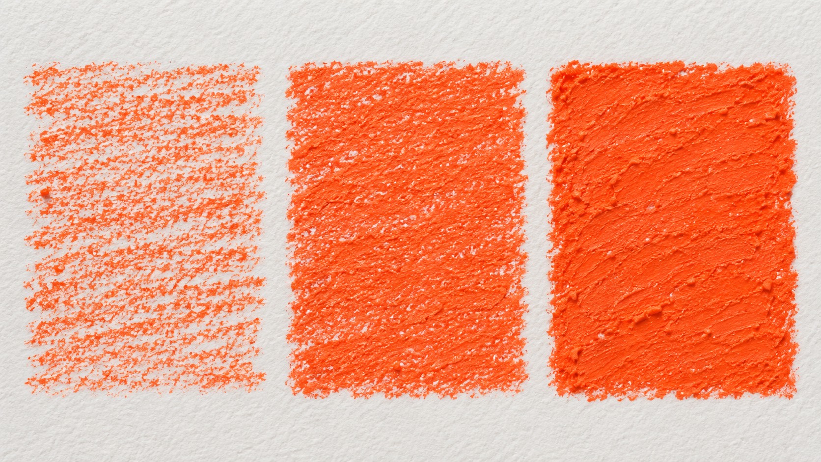
Do not expect the third box to be perfectly solid on every paper. The result depends on the exact stick and surface. The point is to discover which motion gives you the look you want without unnecessary force.
How to get fuller coverage without crushing the mark
If the first pass is too open, make a second pass with strokes close together, slightly overlapping the first. Change direction gently if the gaps follow the paper texture. Use a broader part of the stick for a larger shape, then switch back to a narrower end for its boundary. If the color starts to skid over a heavy waxy area, pressing harder may simply push the existing material around. Stop and examine the surface before adding more.
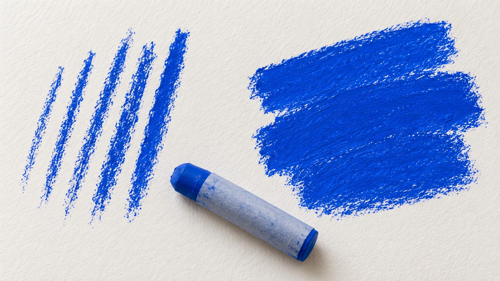
Softness can change how readily a stick leaves color. KUELOX describes its Ultra-Soft Oil Pastels as suitable for smooth application and rich coverage. That is a product description, not a promise that every color will hide every paper or earlier mark in one stroke. The three-box test is still the quickest way to learn what your own set does on your own paper. For a different contact shape, KUELOX’s Professional Square Brick Oil Pastels offer a broad side and corners; compare the marks rather than assuming one shape is always better.
If it still looks patchy, check these three things
- Is the paper especially textured? A strong tooth can remain visible even after a careful pass. If you dislike that effect, test a smoother drawing surface on a separate scrap.
- Are you using only the tip for a large area? Many narrow lines leave narrow gaps. Rotate to a broader contact area and overlap your strokes.
- Are you judging all colors by one color? Individual colors can differ in covering behavior. Repeat the test with the exact shade you plan to use.
The next time white flecks appear, pause before adding force. Ask whether you want the paper to show. If not, test a broader contact, moderate pressure, and a careful second pass. Three little boxes can tell you more than one frustrated, overworked drawing.
Next in this series: how to place a second color over the first without turning the area muddy.