

Which oil pastel colors should you choose: vivid classics, airy pastels, quiet muted tones, or a more distinctive palette? The easiest way to decide is to picture the art you want to make. Think about its mood and subject first; choose the number of sticks second.
Here is a color-first guide to KUELOX palettes. These are creative starting points, not rules. You can paint a landscape with Macaron colors or a portrait with Classic colors. The best set is the one whose swatches make you want to start drawing.
Start with the mood of your artwork
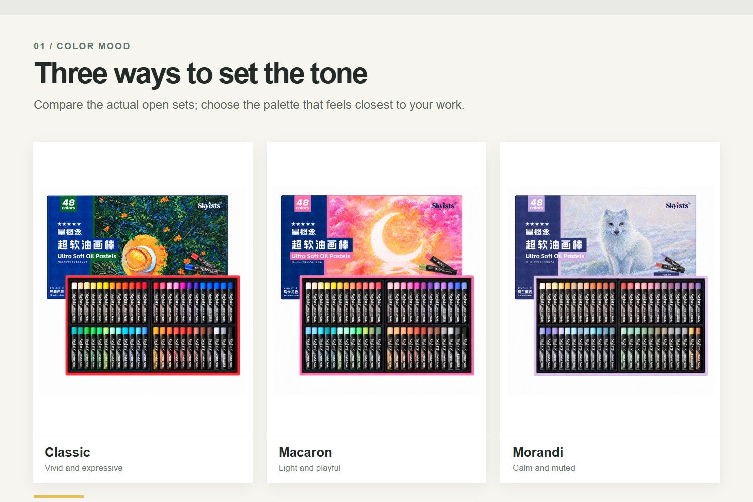
Classic: clear, expressive color
Choose Classic if you enjoy strong contrasts, lively color, and the freedom to move between subjects. Think sunlit landscapes, bright flowers, colorful animals, bold food illustrations, and sketchbook experiments. A blue can play against an orange; a yellow can bring light into a green hillside. If you are still discovering what you like to draw, Classic is a flexible place to begin.
Macaron: light, playful color
Choose Macaron when you want the whole picture to feel gentle and fresh. Its lighter color mood suits spring flowers, soft skies, sweet treats, playful characters, and dreamy decorative pieces. For a soft floral illustration, imagine a pale pink petal, a cream highlight, a mint leaf, and a lilac background. If you like deep shadows or dramatic night scenes, check the actual swatch chart for the darker colors you will need rather than relying on the palette name alone.
Morandi: calm, muted color
Choose Morandi for a quieter, more restrained look. Dusty and softened hues can make a ceramic vase, a café interior, an overcast landscape, or a botanical still life feel cohesive without shouting for attention. It is also a useful direction for portraits when you prefer subtle surroundings and a gentle overall atmosphere. The mood is the draw here: less visual noise, more room for shape, light, and composition.
When you want a more specific color story
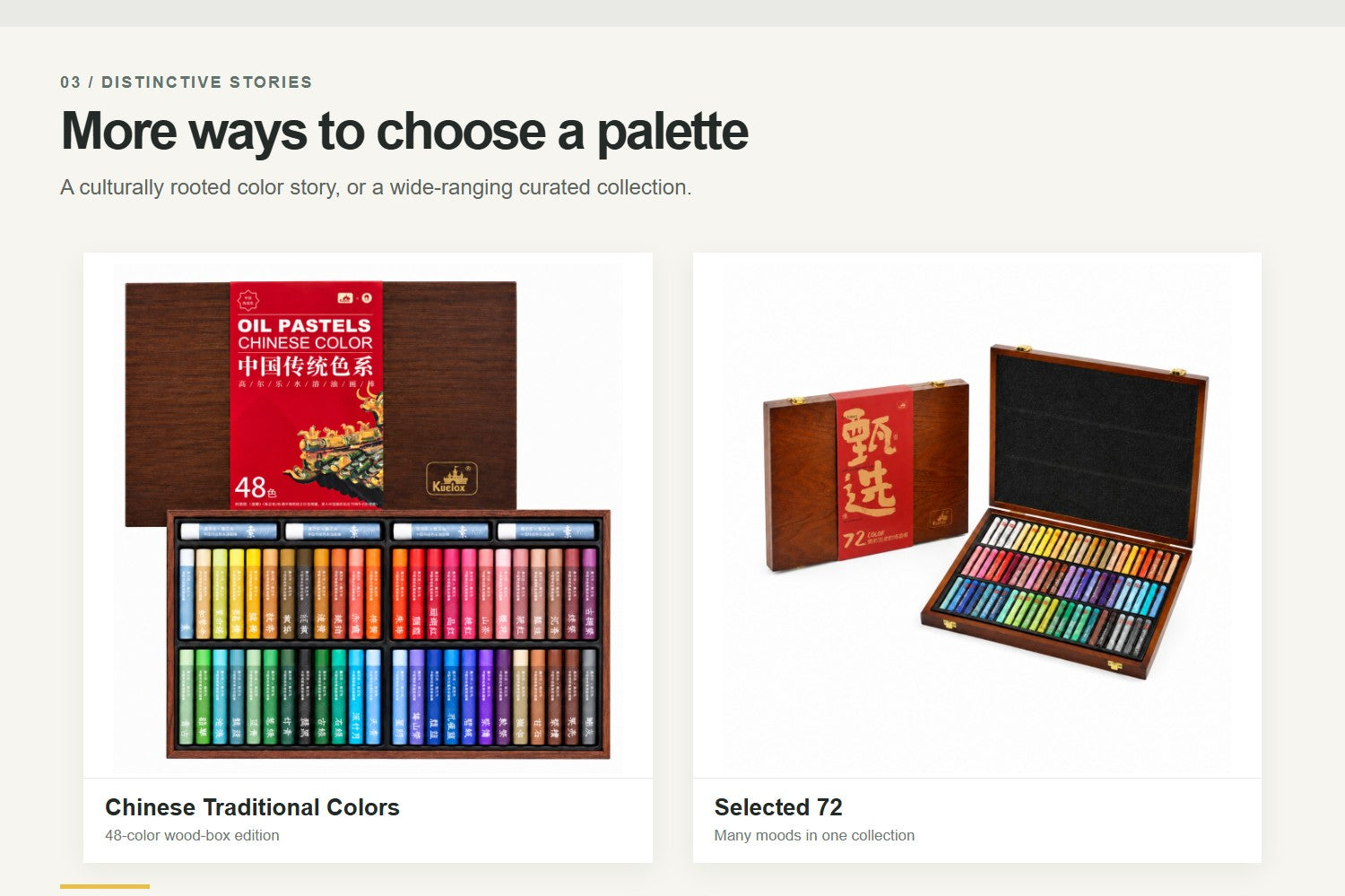
Chinese Traditional Colors: poetic, heritage-inspired palettes
If you are drawn to Chinese color aesthetics, consider Chinese Traditional Colors. This series is an inviting choice for expressive florals, mountain-and-water landscapes, decorative motifs, and artwork built around a considered color harmony. It is not limited to traditional subjects: the same palette can give a modern still life or travel sketch a distinctive tone. Look at the exact color chart to find the combinations that speak to you. The series is offered in 24- and 36-color paper boxes and a 48-color wood box; the 48-color version includes a cloud-pattern color chart.
Skyists: make the accent colors part of the plan
Skyists offers a different reason to choose a palette: special accents. In its 48-color sets, Classic adds extra everyday greens, Macaron includes three neon colors, and Morandi includes three metallic shades. Choose the Classic option if your drawings often need varied foliage; Macaron if a small fluorescent pop suits your characters or graphic work; or Morandi if you want metallic details in a mostly subdued composition. The special colors differ by palette, so check the variant rather than expecting all three kinds of accents in one box.
Selected: room to move between moods
The Selected 72-color set brings Classic, Macaron, and Morandi color moods together. It makes sense if you regularly switch from vivid landscapes to pale florals to muted interiors—or if you are choosing a gift for someone whose favorite subject is still unknown. Think of it as a broad, curated palette, not as a guarantee that it contains every shade from every smaller set.
Then choose 24, 36, 48, or 72 colors
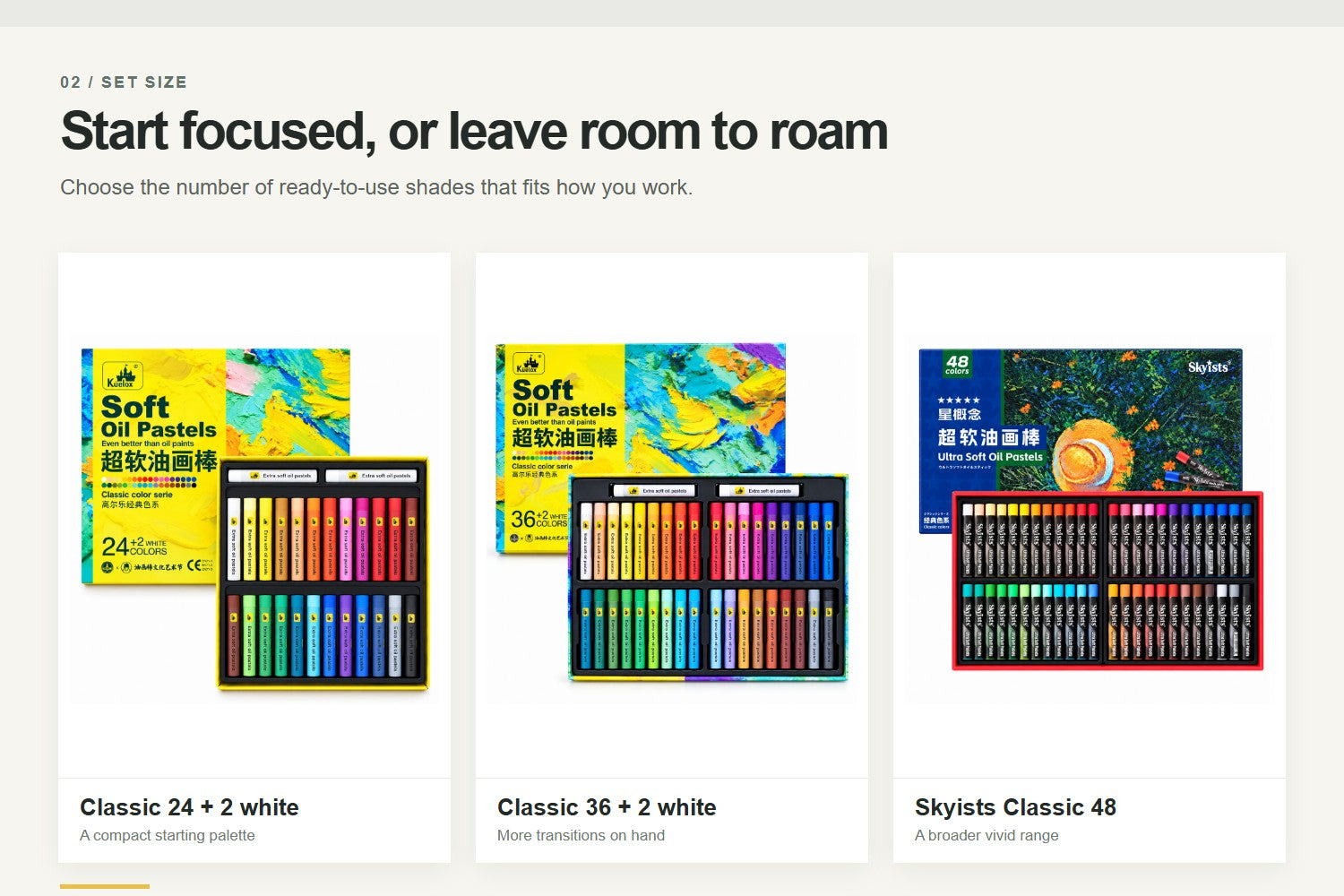
24 colors can be a good fit for focused studies, a first set, or an artist who enjoys mixing and planning around a tighter selection. 36 colors give you more ready-made transitions when you move between light, middle, and dark passages. 48 colors are worth considering if you draw many subjects or want more choices close at hand. 72 colors, in the Selected set, are for artists who want several color moods in one collection.
More colors do not automatically make a picture better. Nor should you assume that a 36-color box is simply the 24-color box plus twelve predictable shades. Compare the swatch chart for the exact series and set size, especially if a particular green, skin tone, blue, or neutral matters to your work. The KUELOX Color Codes Index can help you explore shade names and codes, while each product’s own chart is the place to confirm which shades are in that box.
A quick choice by subject
- Bright landscapes or bold flowers: start with Classic; compare Skyists Classic if varied greens are important to you.
- Spring florals, sweet illustrations, or soft skies: start with Macaron; consider Skyists Macaron when you also want neon accents.
- Still lifes, interiors, and atmospheric scenes: start with Morandi; consider Skyists Morandi if metallic highlights fit the idea.
- Chinese-inspired florals, landscapes, or decorative color stories: explore Chinese Traditional Colors and its exact swatch chart.
- A little of everything: compare a Classic 48-color set with Selected 72, depending on whether you want one vivid family or several moods.
One final test before you choose
Pick a piece you would genuinely like to draw this month. Then find five colors on the set’s chart: a main color, a light, a shadow, a contrasting accent, and a quiet connecting color. Can you see your picture in that group? If yes, you have found a useful palette—even if it is not the largest box.
Start with the feeling you want your art to leave behind. Let the subject point you toward a color mood, check the actual swatches, and only then decide how many colors you need.