

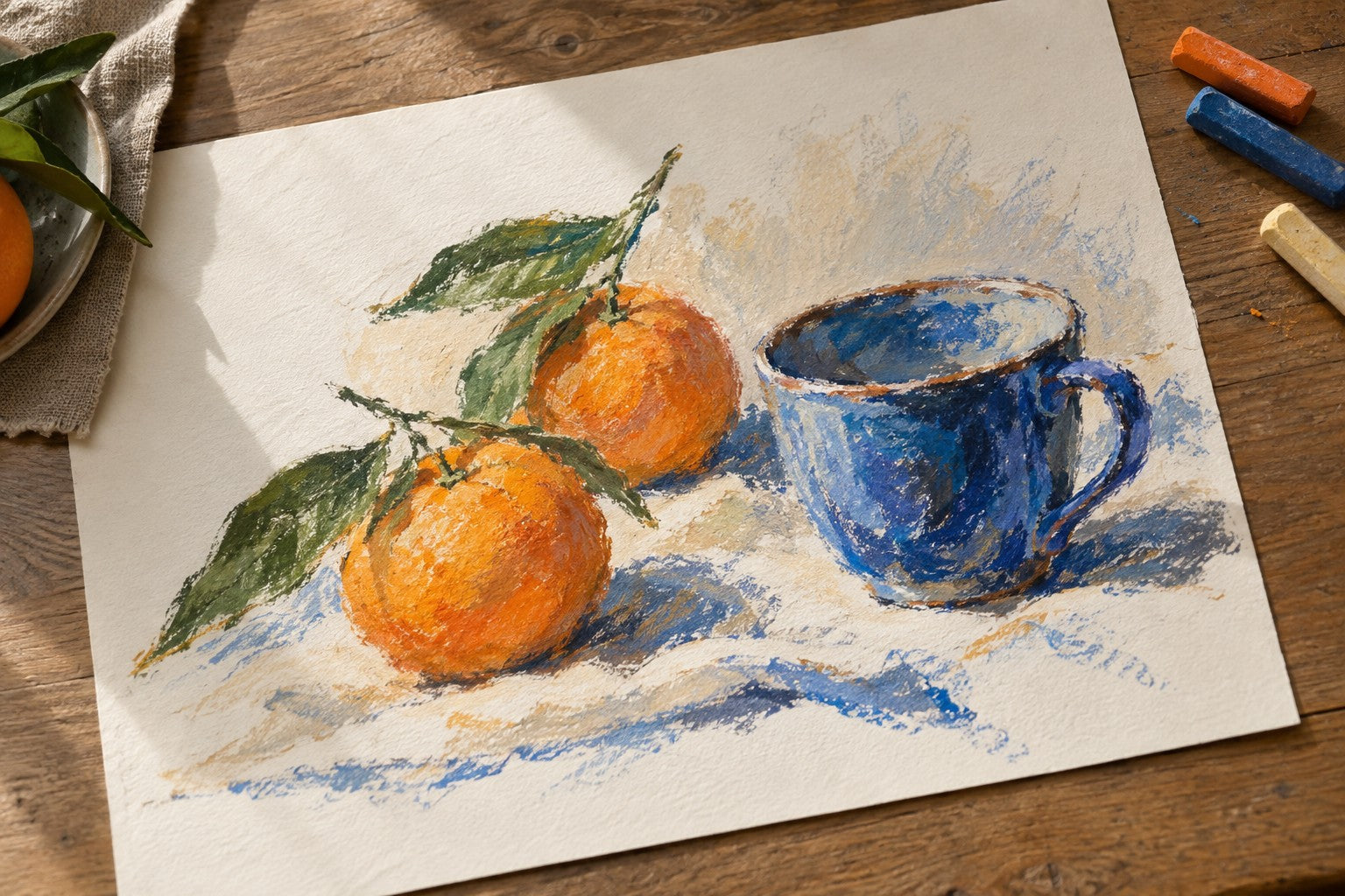
Editorial illustration of an oil-pastel-style drawing on textured paper.
If you have only used school wax crayons, your first oil pastel can be surprising. It may look like another colored stick, but the mark can feel softer, sit more heavily on the paper, and move when you rub it. That difference changes how you build a picture.
The short answer: A typical wax crayon gives you a firmer, more controlled line. An oil pastel usually deposits a softer, thicker layer of color that is easier to blend and build into broad shapes. Neither is automatically “better.” The right tool depends on whether you want crisp, economical marks or a more painterly surface.
This article compares ordinary wax crayons with oil pastels. It is not a comparison between soft and firm oil pastels; we covered that separate beginner decision in the previous guide.
The difference begins in the color layer
Both materials carry pigment in a stick, and both can contain wax. The important distinction is the binder balance: a conventional wax crayon relies mainly on wax, while an oil pastel combines pigment with oil and wax or another soft binder. Exact recipes vary by maker and product, so the label alone cannot tell you precisely how every stick will perform.
What matters while drawing is the layer each one leaves behind. With a typical crayon, the stick resists the paper a little more. Light strokes often catch the raised parts of the paper and leave small white gaps. An oil pastel generally gives up more material as you draw, so adjacent strokes can join into a fuller field of color. Pressing harder may make either mark denser, but pressure is only one variable; stick softness and paper texture matter too.

Illustrative comparison adapted from a demonstration video, not a controlled product test. Left: crayon marks; right: oil pastel marks, with Kuelox Extra Soft shown in the inset. Results may vary with paper, pressure, and technique.
Look at the small white gaps within the marks. On the crayon side, more of the paper texture remains visible and the strokes stay distinct. On the oil-pastel side, color builds into a denser layer with a smoother transition between shades. Neither effect is inherently better: choose textured marks when you want visible lines and paper grain, or fuller coverage when you want a broad area of color. The result also depends on the paper, pressure, and specific sticks you use.
What happens when you try to blend?
The next difference appears when two colors meet. Put blue beside orange and gently rub the boundary. A soft oil-pastel layer can usually be pushed and mixed at that edge. A typical wax crayon tends to keep its separate lines more clearly unless you build up more color or use another technique. Crayons can be layered and blended; they simply invite a different working rhythm.
Oil pastel is not a shortcut to a perfect gradient. If you rub every part of the drawing, you can lose the lively strokes that make the medium interesting. In many pictures, the strongest approach is to blend only a narrow transition and leave the outer marks visible.
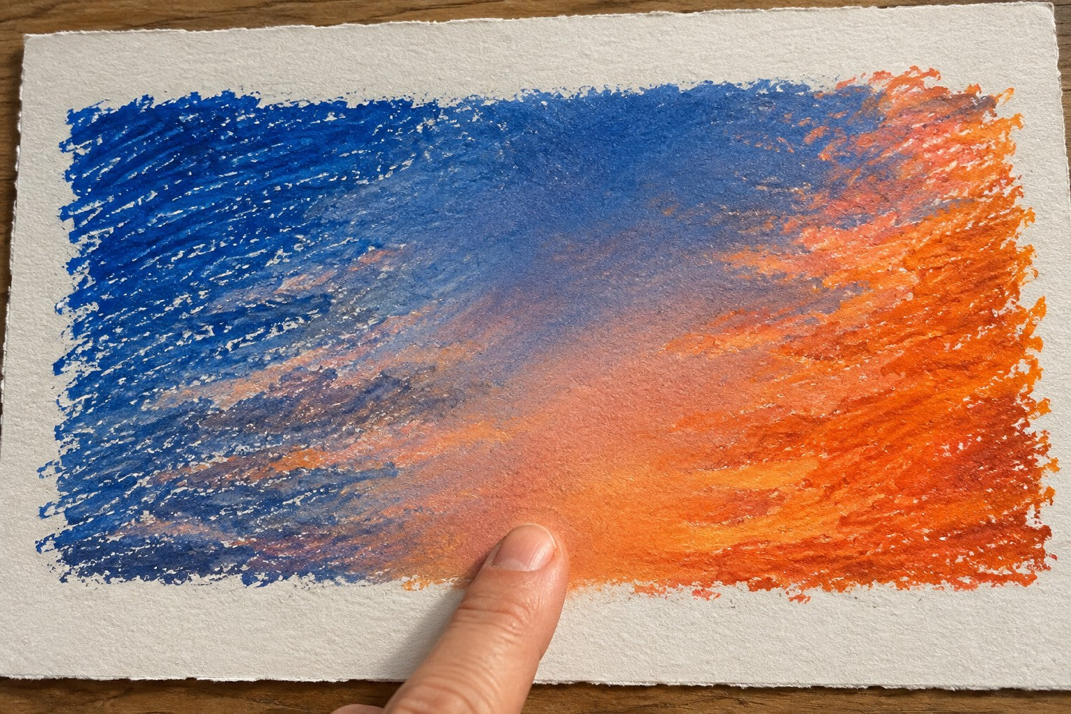
Illustrative technique image: distinct strokes remain at the sides while only the central edge is softened.
Try this on a small sky: place the colors next to each other with light pressure, add a few short overlapping strokes at their meeting point, then rub just that narrow strip with a clean finger or blending tool. If the colors turn dull, stop adding material and test the combination on scrap paper first. We will cover the order of layers and muddy colors in a separate guide; the point here is how readily the mark itself can move.
Why might an oil pastel still look like a crayon?
“Oil pastel” does not mean every stroke will be thick and opaque. A firmer oil pastel, a very light hand, a pale pigment, or a rough sheet can all leave visible paper grain. A soft pastel can also look broken in the first pass if you skim it over the surface. Likewise, a wax crayon can build surprisingly strong color with repeated strokes.
That is why a single swatch on a screen is a poor verdict on a material. Compare marks on the same sheet, with similar colors and the same pressure. Start light, then build a second layer. You will learn more about the tool than you will from a claim that one medium “always covers better.” Our next guide will go deeper into pressure and coverage.
A five-minute side-by-side exercise
You do not need to finish a painting to feel the difference. On one sheet of drawing paper, draw two small rectangles. Choose a wax crayon and an oil pastel in similar mid-tone colors, and keep the paper and lighting unchanged.
- Fill the first half of each rectangle with one light pass. Notice how much paper remains visible.
- Fill the second half with three overlapping passes, without grinding the stick into the sheet.
- Add a neighboring color at one edge. Gently rub only a finger-width of that edge, cleaning your finger between samples.
- Photograph both rectangles together. Judge the mark's thickness, the visible paper grain, and how much the edge moved—not just which color looks brighter.
If one sample seems weak, repeat it with another color before blaming the whole medium. Pigments differ, and a fair comparison is about behavior rather than a contest between two particular shades.
Which medium should you pick for a picture?
Choose a wax crayon when you want visible hatching, firm lines, less material on the page, or an easy tool for quick sketches. Choose oil pastels when you want broader color areas, a tactile surface, and the option to soften selected edges. You can also use both in a sketchbook to discover which marks suit your subject. This is a creative choice, not a ranking of “serious” versus “beginner” materials.
If you want to try the softer side of oil pastels, Kuelox Best First Ultra-Soft Oil Pastels are designed for smooth application and easy blending. For a different mark-making experience, the Kuelox Professional Square Brick Oil Pastels offer a broad face for color areas and edges for more controlled marks. The shape and softness of these sets are different choices within the oil-pastel family; neither turns an oil pastel into a wax crayon. You can compare the available sets in the Oil Pastels collection.

Actual Kuelox product and swatch photograph from the Professional Square Brick product page. It shows the look of these sticks and sample marks; it is not the wax-crayon comparison described earlier.
Frequently asked questions
Are oil pastels just crayons with a different name?
No. The two categories overlap in their stick format and sometimes in their ingredients, but conventional wax crayons and oil pastels usually leave noticeably different marks because of their binder balance. Their exact behavior still varies by product.
Do oil pastels dry like oil paint?
Generally, no. Most oil pastels use a non-drying or non-siccative binder and do not form the same hard, fully cured film as traditional oil paint. A surface may feel less tacky over time, but do not assume that makes it safe to stack unprotected. We will cover handling and storage in later guides.
Are oil pastels always more opaque than crayons?
No. A soft, strongly colored oil pastel can give very dense coverage, but opacity depends on the pigment, formulation, paper, pressure and number of passes. Test the color you plan to use rather than relying on a blanket promise.
The takeaway
The useful question is not “Which stick is better?” It is “What kind of mark do I need?” Crayons preserve a firmer drawing feel; oil pastels make it easier to put down and move a fuller color layer. Once you notice that difference, you can choose deliberately—and begin to control the particular oil-pastel marks you want in your own work.